
The NCAA website

I have chosen The NCAA website as another good website for my project. The URL of this website is https://www.ncaa.com/ . Anyone can find this website if they look for it on the first try. The website is made for the NCAA or college sports. They keep a home button on every single page so people can easily return to the home page and if you can't find the home page, just click the NCAA logo. They archive old data so people can catch on sports news they have missed and all the information on a page is all relevant to the website's original information. If you need to find old information, they break the website into archives of seasons the players play. The information on the page is evenly spaced throughout the webpage so it is not cluttered. The audiences of website can range from the viewers of the NCAA or just plain old sports fans.
They include an effective use of headers and sub-headers so the viewers can easily navigate through the webpage. The headers break down into sub-headers that give you a general description of the page so you can find the main information you want simply and easily. The headers are split logically so the information is where you would expect it and you don't have to waste your time looking for it. It evens breaks the sports down to the divisions so you can track your favourite teams easily and quickly.
![]()
The website is constantly updated every single day so you can rely on the information given to you. They include social networking components so people can follow the website and tell the viewers friends about the website. They also include apps so you go on the website on your phone. They include optional surveys so the website is better suited to the public.

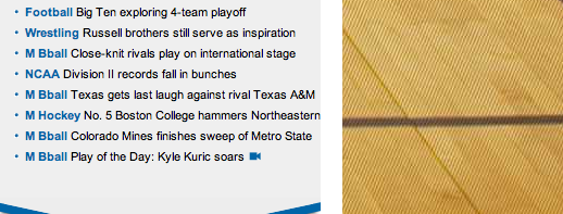
The website has a great font colour to background colour contrast so it is easy to read. The font size is an average size and is easy to read of people of all ages. The background is a basketball court and it has a clear difference to the colour of the writing. The background is simple and it doesn't take away the viewers' attention away from the writing.
Even a great website can improve itself like:
- Including a site map for easy navigation for those people who don't know what to look for.
- When clicking on a article, it should include a related articles on the side.
- It should have a chart style layout so it doesn't get too long when scrolling down.
- Include more details in the articles so it is more interesting.
- Have more videos on the website.