
Website do's and don'ts
My partner, Danish, and I came up with 10 website do's and don'ts. Here are the ones we have chosen for this page.
Do's:
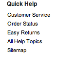
- Provide a site map for easy navigation around the website.
- Allow many social networking compenents to keep viewers interested in the website.
![]()
- Have a clear font size so it is readable by all viewers.
- Have a simple URL so anyone can find the website.
- Keep pages small so people don't have to scroll too much.
- Constantly update the website so the information is up to date.
- Include a home button on every single page to make it easier for the viewer.
- Include a skip button when watching videos so the viewer doesn't get bored and leave.
- Check for any grammer and spelling mistakes because it looks unprofessional.
- Keep navigation simple so the readers don't have to look for a page.
Don'ts:
- Have a cluttered background because it takes the viewers attention away.
- Have a complicated URL so people who don't know the website, can find it.
- Avoid having flashing lights on the website because it is distracting/annoying and takes away the viewers attention.
- Avoid having long adds on videos.
- Have a colour scheme that blends in because it looks bad in the viewers eyes.
Example of a bad background:
- Have a light font colour or a small font size.
Example of a bad font size and colour:
- Put too much different information on the same page.
- Avoid having broken links on a website because now the viewer is either mad and leaves or has to look for the page if it exists.
- Change the layout throughout the page because the viewer can now think that he/she is on a different website and leave.
- Put random articles in any spot you can find because it starts to look too messy.